

Try this. Looking at this photo, squint your eyes so that all the details go away, and stare at it for a few seconds.

Notice that within those luscious colors, what you are seeing is mostly in shadow.

Even though the colors are striking, the brightness we see is mostly the pieces of sky visible through the foliage. Let’s remove the color to make it easier to see exactly how much of it is in shadow.

If you compare the mid-to-dark areas of the value scale to the blurred monotone photo, it becomes obvious how minimal the light is in the scene. At the same time, if we pluck any one of those leaves and look at it individually under the light source, it would appear something like this.

Here’s a slightly blurred close-up view of one of the sections. Notice the difference in the color of the leaf above, not in shadow, and the leaves below in shadow.

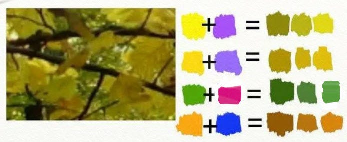
Once we recognize that an area of color is in shadow, we know immediately that regardless of how brilliant it seems to us, the only way we can interpret it accurately is to reduce the value and intensity of hues we recognize. Here are some suggested combinations for you to play with to make that discovery.
What a fun way to explore shadow colors!
great lesson thankyou
thankyou Dianne once again you helped me