

Small Changes in Value Contrast Can Give Clarity
SATURDAY MORNING ART THOUGHTS
A scene that interests you as a subject for painting might need attention where it lacks clarity. Scenes found in historical cities often do that, but so do other subjects. The photo below caught my eye as typical. The foreground monument wants attention, but is visually fused with the background structures. Can it be given clarity? Let’s find out.

First, let’s examine what’s causing the visual fusion, making the monument difficult to see. Notice how similar the values (especially the degrees of value contrast) of the background structure are to the foreground statue. That similarity of value contrast is why they are visually fused.

There are multiple degrees of value contrasts available to us. We can revise what we see into a value contrast that is not quite so close, and give clarity to the images while still conveying their spatial relationship to each other. It’s surprising how little that change needs to be.
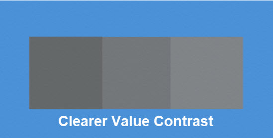
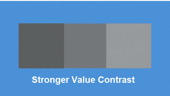
Below are three examples of value contrasts. Notice how just a little more contrast in the second example prevents the values from visually fusing, like they do in the first example. Then, in the third example, look at how a more substantial degree of contrast further enables us to differentiate its squares.

Applying that principle to this scene, here’s what happens.
